Google has officially moved beyond its long-standing flat and four-color icon style by introducing a modern gradient-based redesign across many of its core applications. From Gmail and Google Drive to Meet, Chat, and Calendar, the new Google icons are not just visual upgrades—they represent Google’s larger transition toward an AI-driven ecosystem.
For years, Google relied on simple, clean, flat-color icons that became instantly recognizable around the world. While those designs successfully established brand familiarity, the digital landscape has changed dramatically.
Today’s interfaces are more dynamic, AI-powered, and visually adaptive. Google’s latest redesign reflects that evolution. Many users have not fully embraced the new google icons, as they still prefer the simplicity and familiarity of the previous designs.
![]()
Why Google Introduced Gradient Icons
The biggest reason behind the redesign is modernization. Technology companies are increasingly moving toward softer visuals, layered color transitions, and more fluid interfaces. Google’s gradient icons bring a sense of motion and depth that the older flat icons lacked.
The redesign also aligns with Google’s broader AI strategy. Products like Gemini, AI-powered Search, and intelligent Workspace tools already use gradient-inspired visuals. By updating app google icons with similar styling, Google creates a unified visual identity across its entire ecosystem.
Another important factor is scalability. Modern devices range from compact smartwatches to ultra-high-resolution displays. Flat icons often appear too harsh or simplistic on advanced screens. Gradient elements improve visual clarity while making google icons feel more polished and premium.
Enhanced Visual Appeal
One of the most noticeable benefits of the redesign is the improved visual appeal. The previous flat-color icons were simple and functional, but many users considered them overly minimalistic. The new gradient approach introduces softer color blending and a more natural appearance.
The gradients create smoother transitions between Google’s signature colors—red, blue, yellow, and green—making the icons appear more lively and modern. Instead of hard color separations, the updated design flows naturally, which feels easier on the eyes during prolonged usage.
This design philosophy also gives the apps a more premium look. The subtle blending effects add depth without making the icons overly complicated. As a result, the new google icons look futuristic while still remaining recognizable.
Improved Accessibility and Screen Adaptation
Google has also focused heavily on accessibility and display optimization. The gradient icons are designed to remain clear across different device sizes and screen resolutions.
On smaller screens, gradients help soften sharp edges and improve icon visibility. On larger displays, the color transitions appear richer and more refined. This adaptability ensures consistency whether users access Google apps on smartphones, tablets, Chromebooks, or desktop monitors.
The redesign also improves visual hierarchy. Users can quickly identify apps because the colors now feel more organized and intentional rather than separated into rigid blocks.
Stronger Brand Cohesion Across Google Products
Google’s redesign is not happening in isolation. It closely matches the company’s updated “G” logo and the design language already visible in Gemini AI products.
Previously, some Google apps looked disconnected from one another because of varying icon styles. The gradient redesign creates stronger cohesion across the ecosystem. Whether users open Gmail, Meet, Drive, or Chat, the apps now share a consistent visual identity.
This consistency is especially important as Google expands its AI integration. A unified design language helps users instantly recognize Google’s services regardless of the platform they are using.
The redesign also reflects confidence in Google’s evolving ecosystem. By maintaining recognizable color patterns while modernizing the visuals, Google balances innovation with familiarity.
What are the Changes and How they look like
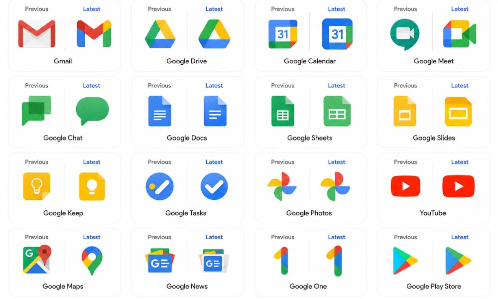
Gmail
The Gmail icon still preserves its iconic “M” envelope shape, but the design now feels softer and more rounded. Red remains the dominant color, while yellow, green, and blue gradients subtly blend into the structure. The result is a cleaner and more modern appearance that maintains instant recognizability.
Google Drive
Google Drive’s triangular icon continues using green, yellow, and blue, but now adopts smoother gradients and a more refined shape. Red has been removed from the design, creating a more focused and balanced visual structure. The rounded triangular appearance gives Drive a cleaner and more contemporary identity.
Google Calendar
Google Calendar shifts toward a richer blue tone while embracing the new gradient styling. The updated icon feels more professional and visually consistent with the rest of Google Workspace.
Google Meet
Meet receives one of the most dramatic changes in the redesign. Yellow becomes the primary highlight color, giving the app a brighter and more energetic personality. The gradient effect also improves depth, helping the icon stand out more clearly on crowded home screens.
Google Chat
Google Chat now features a pill-shaped message bubble with green as the dominant tone. The softer shape makes the app feel more approachable and modern compared to the older angular design.
Docs, Sheets, and Slides
Interestingly, Google retained the single-color identity for Docs, Sheets, and Slides. However, subtle refinements and orientation changes improve usability.
Sheets and Slides now use landscape-style visuals that better represent spreadsheets and presentation layouts. These changes make the apps easier to identify at a glance.
Reflecting Google’s AI Future
The gradient redesign is more than just a cosmetic update—it symbolizes Google’s transition into the AI era. Artificial Intelligence is becoming deeply integrated into Google Workspace, Android, Search, and cloud services. The new visual identity reflects intelligence, adaptability, and fluidity, which are core characteristics of AI-powered experiences.
Gradient visuals are also commonly associated with modern AI interfaces because they create a sense of motion and transformation. Google’s redesign therefore acts as a visual signal that the company is evolving beyond traditional software experiences.
User Reactions and Industry Impact
User reactions to the redesign have been mixed but largely positive. Many users appreciate the softer and more premium appearance, while others feel nostalgic about the older flat-color icons.
However, industry experts generally agree that the redesign was necessary. As user interfaces become increasingly AI-centric, static and rigid designs risk appearing outdated. Google’s shift may also influence other technology companies to adopt more dynamic branding strategies in the near future.
Final Thoughts
Google’s gradient icon redesign is more than a simple visual refresh; it represents the company’s transition into a modern AI-focused ecosystem. The new google icons feel smoother, more dynamic, and visually balanced compared to the older flat four-color designs. By introducing gradients, softer edges, and improved scalability, Google has created icons that look better across smartphones, tablets, desktops, and larger displays.
The redesign also strengthens brand consistency across apps like Gmail, Drive, Meet, Calendar, and Chat while aligning with the visual identity of Gemini and other AI-powered services. Although some users may prefer the simplicity of the previous icons, the updated design reflects current UI trends and the growing influence of
AI in digital products. Overall, Google’s new gradient icons successfully modernize the company’s identity while maintaining the familiarity and recognition that users have trusted for years, making the redesign both practical and future-ready for the next generation of technology experiences.
FAQ
Why do individuals prefer the previous Google icons?
Many users prefer the previous Google icons because they were simpler, easier to recognize, and visually distinct from one another. The flat-color design also created a sense of familiarity over the years.
Are there any effects of changing Google icons?
Yes, changing Google icons can affect user experience and brand perception. While the redesign improves modern appearance and consistency, some users may initially find it difficult to identify apps quickly due to the similar gradient styling.
How does the Google icon redesign relate to the advancement of AI?
The new gradient icon redesign reflects Google’s AI-focused future. The softer gradients and fluid visuals align with AI-powered products like Gemini and represent a more modern, intelligent, and connected ecosystem.